Responsive Design
RGBtoHEX HTML5 Validator html5check.py
Icon: icons8.com How To Become UI UX Designer CSS flexbox Fundamentals Visual Guide Accelerated Mobile Pages: Google AMP in 2019 why AMP bad Web Guide: CSS Counters building-a-consistent-ui-design-system
:not() Selector 26 Steps of Product and Dashboard Design
.two-line {
  line-height: 1.5em !important;
  height: 3em;
  overflow: hidden;
  text-overflow: ellipsis;
  white-space: pre-line;
  display: -webkit-box;
  -webkit-box-orient: vertical;
  -webkit-line-clamp: 2;
}
CSS3 Mouse Hover Effect in Image
<body oncontextmenu="return false" onselectstart="return false" ondragstart="return false">
Good to Great UI Animation Tips Animated Nav Component Best Practice for Minimalist Web Design Responsive Design with CSS Variables with a Line of CSS Design Style Guides Example CSS or JavaScript: When to Use 5 JavaScript Guidelines When Using Important is the Right Choice CSS Techniques for Image Important CSS Concept Material UI Library eea.googlecharts
中文字型: 顯示順序設定原則 : 英文在前、比較通用的設定在後面。
font-family: Georgia, 標楷體
Mobile Design
Designing Notification for Apps
HTML Structure
<html>
</html>
Portal Columns
Henry Lin: 在同一個網頁 (網址) 響應各種裝置特性 (尺寸) 調整呈現形式,讓使用者有舒適的瀏覽體驗。
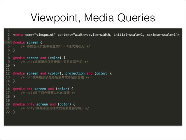
除了 Responsive 之外,像 Adaptive 或 Mobile 也是相關概念的形容詞。使用 Viewpoint 來標示,可以細分為 Flexible Layout、Media Query、Flexible Media 三個重點,用來深入淺出體驗 Responsive Design 想要達到的效果。
<meta name="viewpoint" content"width=device-width, initial-scale=1, maximum-scale=1">
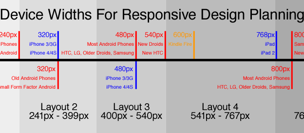
Responsive Web Design With HTML5 CSS3: p.11 應該先從最小尺寸的螢幕開始設計,再逐步擴展至大尺寸的螢幕,重點不是侷限在顯示尺寸的調整,而是針對不同設備的特性,讓使用者享受特有的內容或功能。HTML5 提供更豐富的語意設定,CSS3 提供更精簡的展現設定,它們都是設計上的重要工具。
.col-xs- .col-sm- .col-md- .col-lg-
auto     750px    970px    1170px
auto     ~62px    ~81px    ~97px
30px (column both sides: 15px)
HTML Table getting-started-with-html-tables https://medium.com/@timigod/front-end-vs-back-end-vs-client-side-vs-server-side-7a04b3ec8764
Liquid Layout Example Free HTML5 Templates
工具 Viewport Testing Tools Breakpoint Screenfly Responsivepx.com
Firefox: Firesizer
Recreate Medium Article Layout with CSS Grid
Viewport vs Screen Size
Table Center Table Tutorial Table CSS Example LayoutIt.com: Bootstrap Interface Builder
sc.social.like: icon made with SASS + SVG Image Loading using SVG as Placeholder Boxy SVG Editing Tool
Responsive
Table: CSS + Grid Layout
Responsive Design for SixFeetUp
Responsive Design Workflow Using Two Browsers
Samples: http://www.doaks.org/ Navigation Patterns Data Tables Text Font Icon Unicode Characters: amp-what
metadata clickable links: Products.Poi
CSS
CSS:
div.row span.left {  float: left;  text-align: left;  font-weight: bold;  color: #fff;  width: 49%;  }
div.row span.right {  float: right;  text-align: right;  font-weight: bold;  color: #fff;  width: 49%;  }
HTML:
<div style= "width: 90%; background-color: #666;border: 1px solid #333; padding: 0px; margin: 0px auto;"><div class="spacer"></div>
<div class="row"><span class="left">首頁 > 產品</span><span class="right">[商標]</span></div>
<div class="spacer"></div>
</div>
Positioning 中文縮排/凸排 範例 list-style-position: outside; {margin-left: 4em; text-indent: -4em} Alignment Howto Quick - margin: auto; width: 50%
wrap 換行 line break overflow-wrap
Leading Label with Multiple Lines Followed
FOLLOWED Multiple Lines
ANOTHER LINE
內框線 .box {background: white; border: red 1px solid; box-shadow: 0 0 0 5px white;}
Mockup Modal Dialog Size: max-width @plone-grid-float-breakpoint plonetheme.barceloneta/theme/less/modal.plone.less
plonetheme.barceloneta/theme/less/forms.plone.less: jQuery Mobile / Bootstrap 預設方式

Centerization 置中 圖檔置中 box+img 居中設計 Overflow 溢出邊界範圍

Use display: inline-block instead of problematic float:left
Color Blind 色盲支援 LESS 應使用變數而不是相對路徑形式來避免 Mockup 測試錯誤
Complete CSS Flex Box Tutorial LESS not selector 瀏覽器支援度不同 &:not(.plone-toolbar-submenu-header)

left + right cells
<div class="speakers">
  <div class="speaker">
   <div class="speaker-img">
    <!-- img src="" /-->
   </div>
   <div class="speaker-info">
<p>Research Professor<br>
Dr. Alayne Street-Perrott<br>
Swansea University, United Kingdom</p>
   </div>
  </div>
  <div class="speaker">
   <div class="speaker-img">
    <!-- img src="" /-->
   </div>
   <div class="speaker-info">
<p>Professor<br>
Dr. Rudolf Brázdil<<br> masaryk="" university="" czech="" republic="" lt="" p="" gt="" div="" pre="">
CSS
.speakers {
  padding: 2.5rem 2.5rem 0 2.5rem;
  display: -webkit-box;
  display: -ms-flexbox;
  display: flex;
}
@media (max-width: 768px) {
  .speakers {
    -webkit-box-orient: vertical;
    -webkit-box-direction: normal;
    -ms-flex-direction: column;
    flex-direction: column;
  }
}
.speaker {
  display: -webkit-box;
  display: -ms-flexbox;
  display: flex;
  -webkit-box-flex: 1;
  -ms-flex: 1 1 50%;
  flex: 1 1 50%;
  border: none;
}
.speaker .speaker-img {
  display: block;
  -webkit-box-flex: 0;
  -ms-flex: 0 0 auto;
  flex: 0 0 auto;
  overflow: hidden;
  position: relative;
  border: 1px solid #eee;
}
.speaker .speaker-info {
  -webkit-box-flex: 1;
  -ms-flex: 1 1 auto;
  flex: 1 1 auto;
}
Z-Index: tips
Pastanaga: demo video